

UI/UX DESIGN SERVICES
User experience and interface design that reduces friction, builds trust, and turns first-time visitors into loyal users
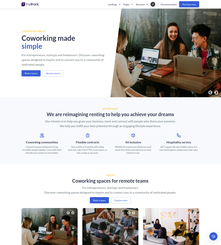
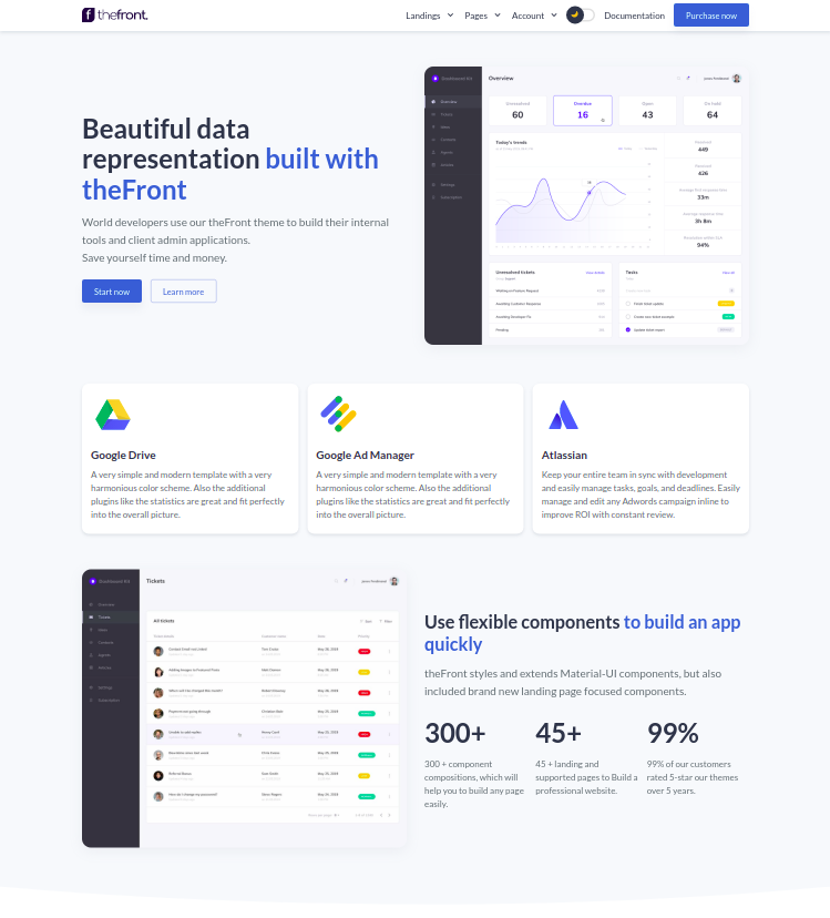
Let's ConnectDesign Built Around the Way People Actually Think
- Research-driven, not assumption-driven
We base design decisions on real user data — interviews, behavioral analytics, usability sessions, and competitor analysis — not on what looks good in a portfolio or what we happen to prefer aesthetically.
- Every screen, every state, every edge case
Empty states, error messages, loading indicators, validation feedback — the details that most designers skip are exactly where trust is built or broken. We design the complete experience.
- Designed to be built, not just presented
Developer-ready Figma files with complete specs, auto-layout components, and a living design system. Your developers get everything they need to build it right — the first time.
Product Design
- End-to-End Product Design
- User Research & Personas
- Information Architecture
- Wireframing & Prototyping
- Visual Design & UI
- Usability Testing
UX Research & Audits
- Heuristic UX Audits
- User Interviews & Surveys
- Competitor Analysis
- Conversion Rate Analysis
- Heat Map & Session Analysis
- Actionable Recommendations
Design Systems
- Component Library Creation
- Design Token Architecture
- Figma Variables & Styles
- Documentation & Guidelines
- Multi-Brand Theming
- Design-to-Code Alignment
UI Design & Redesign
- Web & Mobile UI Design
- Interface Redesign
- Landing Page Design
- Dashboard & Data UI
- Responsive Design
- Interaction & Motion Design
Research Before Pixels
We never open Figma before we understand the problem. User interviews, behavioral data, competitor analysis, and stakeholder alignment come first — so every design decision is grounded in evidence, not aesthetic preference.
Complete Experience Design
We design every screen, every state, and every edge case — including empty states, error messages, loading indicators, and onboarding flows. The details most designers skip are exactly where great products are built or broken.
Tested Before Built
Real users test real prototypes before development begins. We run usability sessions, identify friction points, and iterate on the design until the experience is validated — eliminating the cost of post-development redesigns.
Design Systems That Scale
We build scalable Figma component libraries with design tokens, auto-layout, variables, and full documentation. Your design system grows with your product and keeps your team consistent across every screen and platform.
Developer-Ready Handoff
Figma files structured for developers — complete with spacing specs, component annotations, asset exports, and interaction notes. Your engineering team gets everything they need to build it right without constant designer interruptions.
Accessibility by Default
We design to WCAG 2.1 AA standards from the start — contrast ratios, touch target sizes, focus states, screen reader compatibility, and keyboard navigation. Accessibility is built into every component, not added as an afterthought.
Our Process
- Discovery & Research
We start by deeply understanding your business goals, target users, and competitive landscape. We conduct stakeholder interviews, analyze existing data, review competitor products, and define the design problems we need to solve before any design work begins.
- User Research & Personas
We conduct user interviews, surveys, and behavioral analysis to build evidence-based personas and journey maps. Every design decision is grounded in real user data — not assumptions about who your users are or what they need.
- Information Architecture & Wireframing
We map out the full structure of your product — navigation, user flows, content hierarchy, and screen architecture. Low-fidelity wireframes are reviewed and approved before any visual design work begins, saving costly revisions later.
- Visual Design & Prototyping
High-fidelity Figma designs for every screen, state, and interaction — with a consistent design system, typography, colour palette, and component library. Interactive prototypes let you click through the experience before development begins.
- Usability Testing
Real users test real prototypes. We conduct moderated and unmoderated usability sessions, capture behavioral data, identify friction points, and iterate on the design before a single line of code is written — eliminating expensive post-development redesigns.
- Design Handoff & Developer Support
Developer-ready Figma files with complete specifications, component annotations, spacing values, and asset exports. We stay available throughout the development phase to answer design questions, review implementations, and ensure the final product matches the design intent exactly.

Case Studies

Full UX Redesign That Doubled Trial Conversion for a Project Management SaaS
A B2B project management SaaS had a trial-to-paid conversion rate of 8% against an industry benchmark of 18-22%, with users unable to find core features during their trial and dropping off at an empty dashboard.

Mobile Banking App UX for a Digital-First Neobank
A digital bank launching a mobile-first product needed a UX that could compete with established neobanks while meeting strict regulatory requirements. Their engineer-designed prototype failed usability testing at every critical flow.

Patient-Facing App Redesign for a Hospital Group
A hospital group's patient-facing mobile app had an appointment booking completion rate of only 23%, with patients aged 45+ reporting being unable to complete basic tasks without assistance.
Tools & Technologies
FAQS about Mobile development
UX (User Experience) design focuses on the overall feel of the product — how users move through it, how easy it is to accomplish tasks, and how the product solves real problems. UI (User Interface) design focuses on the visual layer — how the product looks, its typography, colour, spacing, and visual components. We handle both as a unified practice because great products need both.
Yes — it is fundamental to how we work. We conduct user interviews, usability testing, competitor analysis, and behavioral data analysis before and during the design process. Design decisions grounded in research produce better outcomes than those based on aesthetic preference alone.
Figma is our primary design and prototyping tool for all UI/UX work. We use Maze and Hotjar for usability testing and behavioral analysis, Miro for workshops and journey mapping, and Notion for documentation and handoff guides.
Yes, and this is common. We design, hand off developer-ready Figma files, and support your development team throughout the build — answering questions, reviewing implementations, and ensuring the final product matches the design intent.
Yes. We design responsive web interfaces and native mobile interfaces for iOS and Android — following platform-specific design guidelines and designing for the specific interaction models of each platform.
Yes, 100%. All Figma files, components, assets, and documentation are transferred to you upon project completion and final payment. Nothing is held back or locked to our account.
Ready to Elevate Your Digital Experience?
Ask Byte
Ask Byte
Typically replies instantly
just Now
Hi! I'm OrganByte's assistant. How can I help you today?
AI-generated content may be incorrect
