
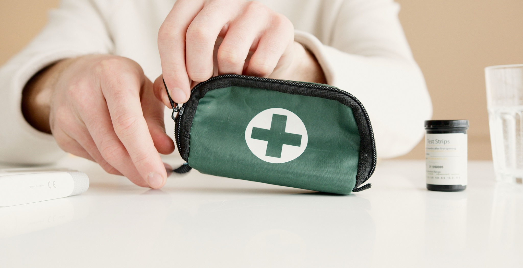
Patient Navigation and Results UX for an At-Home Diagnostics Company
Let's Connect
Overview
What we built
An at-home diagnostics company watched patients drop off at every step between kit delivery and results, especially its older core users. We redesigned the whole journey around plain instructions and visible status, and activation completion rose from 63% to 88%.
In plain terms: a patient could order a kit, get confused activating it, lose track of it after posting the sample, then receive results as a dense portal PDF that raised more questions than it answered. Every one of those steps leaked patients, and the confusion fell hardest on the company's older core users, the people least likely to persist through an unclear process. A meaningful share of kits that were shipped were never returned at all, which meant the diagnostic itself never happened.
We mapped the full patient journey and ran 4 rounds of moderated usability testing with the company's older core demographic, then redesigned every touchpoint: a step-by-step activation flow with photographic cues instead of text alone, a live kit-status tracker so a posted sample never simply disappeared from view, an SMS reminder cadence, and plain-language results screens written together with the clinical team. Kit activation completion rose from 63% to 88%, sample return rose 17 percentage points with reminder-driven returns landing 4 days sooner, status-related support contacts fell 52%, and task success in usability testing reached 93%, up from 58% on the legacy flows.
The Problem
Drop-offs at every step
The patient journey leaked people at every stage rather than at one obvious failure point. Activation instructions confused the company's older core users from the very first step, which meant some patients never got as far as collecting a sample at all. A process meant to feel reassuring instead felt uncertain from the moment the kit arrived.
Once a sample was posted, it effectively vanished. Nothing told a patient their sample had been received, was being processed, or was on track for a result, so patients were left waiting with no sense of whether anything was actually happening. A meaningful share of shipped kits were never returned at all, meaning the uncertainty of the early steps carried all the way through to patients simply not finishing the process.
Results, when they arrived, did not resolve the anxiety the journey had built. A dense portal PDF is not how most patients want to receive a health result, and predictably it triggered anxious support calls from people who could not easily interpret what they were reading. The company had built a good diagnostic and wrapped it in a patient experience that undermined trust at nearly every step.
Confusing activation instructions
Activation instructions confused the company's older core users from the first step, meaning some patients never progressed far enough to collect a sample.
Samples vanishing after posting
Samples disappeared from view once posted, with nothing telling a patient whether their sample had arrived, was being processed, or was on track.
Results as an anxious PDF
Results arrived as a dense portal PDF that patients struggled to interpret on their own, which predictably triggered anxious support calls rather than delivering the clarity a health result should.
Kits never returned
A meaningful share of shipped kits were never returned at all, meaning the diagnostic itself never happened for those patients despite the kit reaching them.
What it was costing them
Every kit that was shipped but never returned was a diagnostic that never happened, wasted cost and a patient left without an answer. Every anxious support call triggered by a confusing results PDF was time spent managing worry the experience itself had created rather than helping patients who needed it. Across an older core user base least tolerant of confusion, that pattern repeated at every step from activation to results.
The Solution
A guided end-to-end journey
We mapped the full patient journey end to end before redesigning anything, so we could see how confusion at activation, silence after posting, and anxiety at results were connected rather than three separate problems. We then ran 4 rounds of moderated usability testing with the company's older core demographic, the group the original journey served worst.
Every touchpoint was redesigned around the same principle: never leave a patient guessing. Activation became a step-by-step flow with photographic cues rather than text alone, a live kit-status tracker replaced the silence after posting, and an SMS reminder cadence kept patients moving without needing them to remember on their own. Results screens were rewritten in plain language together with the clinical team, so a result could inform rather than alarm.
Key decisions
Map the whole journey first
Mapping the full patient journey before redesigning showed that activation confusion, sample silence and anxious results were connected, not three separate problems to solve alone.
Test with the core demographic
4 rounds of moderated usability testing were run specifically with the company's older core demographic, the group the original journey had served worst of all.
Add photographic activation cues
The activation flow became step-by-step with photographic cues rather than text instructions alone, addressing the exact point most patients had struggled.
Make sample status visible
A live kit-status tracker replaced the silence after a sample was posted, so a patient could see it had been received rather than wonder.
Rewrite results with clinicians
Plain-language results screens were written together with the clinical team, replacing the dense portal PDF that had triggered anxious support calls.
Measurable Impact
What changed after launch
The redesigned journey closed the gaps that had been losing patients at every stage. Kit activation completion rose from 63% to 88% after the new onboarding flow launched, and task success in moderated usability testing reached 93% across critical journey steps, up from 58% on the legacy flows.
Behaviour after the kit shipped improved just as clearly. Sample return rates rose 17 percentage points, with reminder-driven returns posted 4 days sooner on average, and status-related support contacts fell 52% once the live kit tracker replaced the old tracking-number email, evidence that visible status answered the questions that used to become phone calls.
Kit activation
63% completion with confusing instructions
88% completion after redesigned onboarding
Sample tracking
Samples disappeared from view once posted
Live kit-status tracker shows sample progress
Support contacts
Status questions driving anxious support calls
Support contacts down 52% with visible tracking
Results delivery
Dense portal PDF patients struggled to read
Plain-language results screens written with clinicians
Headline results
Kit activation completion improved from 63% to 88% after the redesigned onboarding flow launched
Sample return rate rose 17 percentage points, with reminder-driven returns posted 4 days sooner on average
Status-related support contacts fell 52% once the live kit tracker replaced the tracking-number email
Task success in moderated usability testing reached 93% across critical journey steps, up from 58% on legacy flows
Tech & Tools Used
What powered the build
Every tool below earned its place in this engagement. Here is the part each one played.

Figma
Held the redesigned activation flow, kit-status tracker and plain-language results screens through the 4 rounds of moderated usability testing.
FigJam
Mapped the full patient journey from kit delivery to results, connecting activation confusion, sample silence and results anxiety into one shared view.

Maze
Supported the moderated usability testing sessions with the company's older core demographic, measuring task success across critical journey steps.

Storybook
Documented the step-by-step activation and kit-status tracker components so they stayed consistent across every patient-facing screen.

React
Built the redesigned patient journey, including the photographic activation cues and the live kit-status tracker, for production.

Next.js
Served the plain-language results screens and activation flow, built together with the clinical team, to patients.

Tailwind CSS
Styled the redesigned journey consistently across activation, tracking and results screens, keeping the experience calm and legible for the older core demographic.
Amplitude
Tracked activation completion and sample return rates after launch, surfacing the shift from 63% to 88% activation completion.

Hotjar
Recorded patient sessions on the legacy flows, showing exactly where activation confusion and results anxiety were driving support contacts before the redesign.
Ready to Build your Healthcare - At-Home Diagnostics Business with UX/UI Design
Ask Byte
Ask Byte
Typically replies instantly
just Now
Hi! I'm OrganByte's assistant. How can I help you today?
AI-generated content may be incorrect